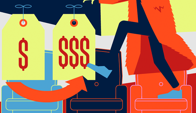
Top 60 Best Online Shops and Key Marketing Tactics to Learn from Each One
What makes an ecommerce store successful? What secret formula do you have to follow to increase your sales?
We've teamed up with Ecommerce Design and selected the next 50 sites for their flawless design, great customer service, unique ideas or just because they deliver an unforgettable experience to their visitors.
Making a good first impression is vital – how many poorly designed websites did you revisit after landing on them the first time? Learn from every single one, even if it's just a logo concept or an idea for your own manifesto, and apply these to your own store.
And by the way, if you want to create an ecommerce store, here is a comparison between the major ecommerce platforms and shopping carts.
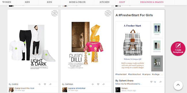
1. Limeroad
- The first thing you see on the website appears to be another online catalog but there's a twist. These are handpicked by users.
- These selections are created from the ‘Scrapbook' feature where the user can create stories using the products in the store.
- They conduct scrapbook contests and participating requires registering as a member. Smart huh?
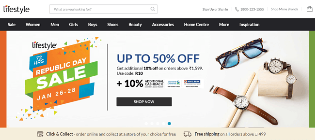
2. Lifestyle
- The slider is always updated with the latest offers.
- They display their highest discounted items on the front page.
- Much emphasis on the word ‘Sale' and there's a Lifestyle Blog section which is updated once every week.
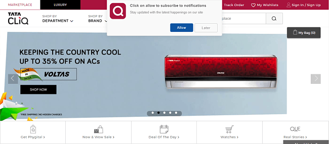
3. Tata Cliq
- This renowned Indian store greets you with the option to subscribe to their notifications.
- Heavily discounted items are labelled as “wow” offers. Much excitement, indeed.
- They feature certain brands and shows their best deals.
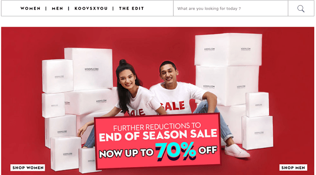
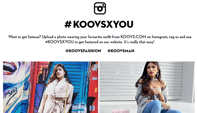
4. Koovs
- A simple yet stylish interface that doesn't beat around the bush. It tells you the best deals in the store.
- The ‘Koovsxyou' features users who snap pictures wearing Koovs products. Talk about intelligent influencer marketing.
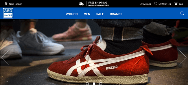
5. 360 Shoes
- What I like about them is that they're pretty straight to the point.
- They sell shoes, feature some brands and have a beautiful slider theme that stands out.
- This is one of the simplest interfaces you can find on an online store and they've pulled it off rather well.
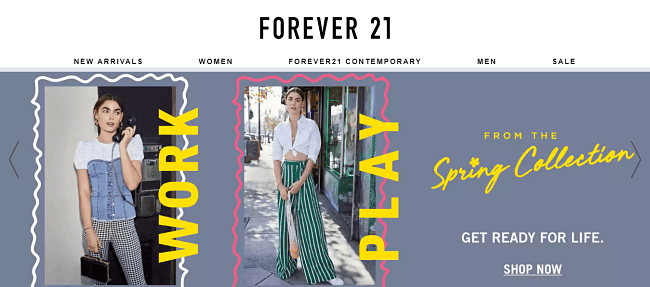
6. Forever 21
- To start with, they have an iconic name – it truly suggests the youthfulness and the freshness of the products they sell.
- They keep the store alive with an affiliate program. Many online stores make use of that to boost promote sales.
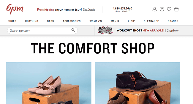
7. 6 PM
- Here's another store with an affiliate program. The biggest highlight is the ‘free shipping' for 2+ items or $50 worth. That will certainly make the visitor think twice. The word ‘Comfort shop' followed by photos of shoes channel the intended thoughts.
- They're not 24/7 as the name suggests but they do have a customer support number visible for everyone to see.
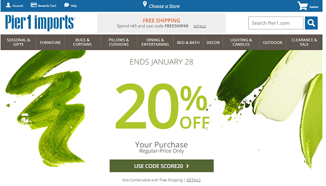
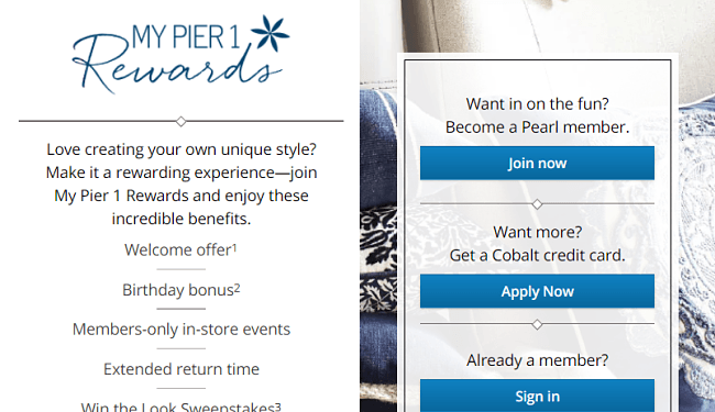
8. Pier 1
- Referral codes, coupon codes, reward card, ‘x % off' – these are some of the first sights a visitor is expected to see and the interface really has potential to convert.
- There's emphasis on a Pier 1 reward card via referrals and other simple tasks like signing up for their newsletter. They seem to know how the reward system of human brains works.
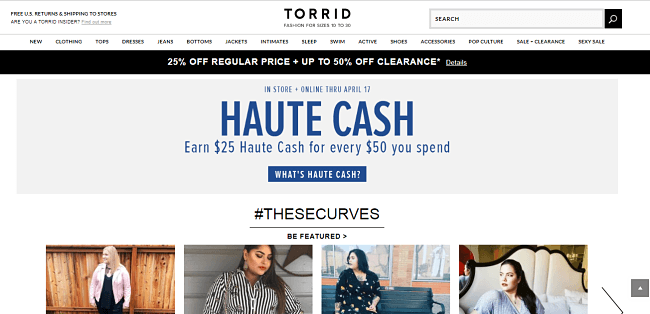
9. Torrid
- One thing I noticed about this store is that they don't really care about size-zero models. The word Torrid means “sultry” and “hot” and they got the message right. Even the title reads, “Plus Size Fashion”.
- They offer pretty much what every popular store does and they have created a modelling contest just like a mini-reality show.
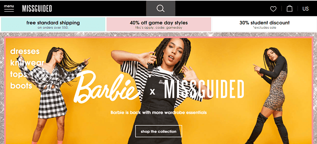
10. Misguided
- The store name sounds radical but that's what defines it. Pretty concise with the details and there's no fluff.
- At the bottom, you can find the necessities and more importantly, the shipping costs.
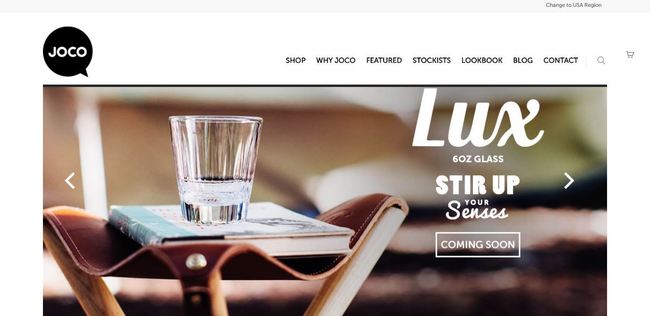
11. JOCO Cups
- Their “Why Joco” page tells the users all the reasons for buying this reusable cup, from the environmental concerns to the well-designed cup and why it would be perfect as a gift for anyone who likes a cuppa, wether of coffee, matcha tea, kombucha or any other magic drink
- This page is also used as an up-sell option – you should try to feature some of your products on most of the pages to attract even more customers.
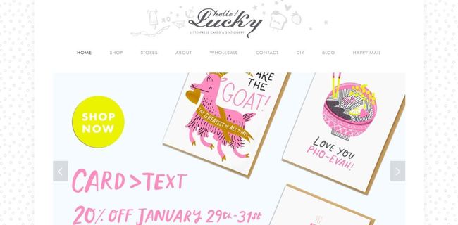
12. Hello!Lucky
- Super cute and funky design, from the header to the patterned background and the happy star favicon.
- The main slider is filled with excellent product photos, just like the rest of the website.
- They offer DIY projects ideas and free printables as an incentive for their readers.
13. Oyster
- Instead of having a list of books on their homepage, they chose to focus on a feeling: relaxing in bed while reading a great book.
- The “Gifts” button increases user activity. After you click on it you are greeted by this cool message: “Why give one book when you can give half a million?”
- Their blog and reviews section are frequently updated and they provide a lot of tempting titles for their readers.

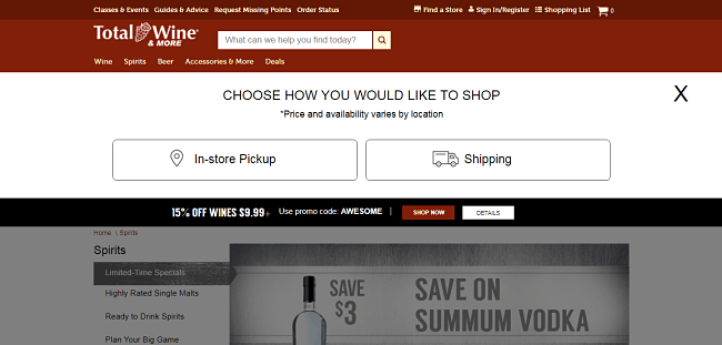
14. Total Wine
- They don't let ages 21 and below on their website. That deserves some respect.
- The product photos have an eye-catching, creative design, some minimal, others very colorful. They don't stick to only one design.
- Promo codes to get different varieties of alcohol. Who could resist?
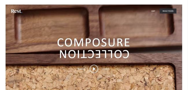
15. Rest
- Bold fonts and a nice mix of colors add up to a very cool, modern feel.
- The ‘$10 off coupon' helps bring in more subscribers, but it doesn't feel intrusive.
- As this charger dock had a lot of publicity, they have the ‘Featured On' widget about halfway on the page.
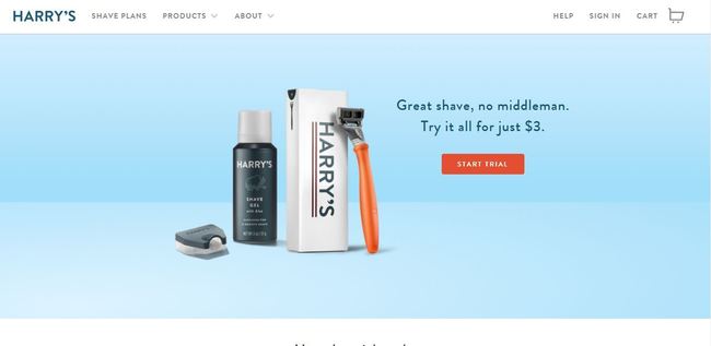
16. Harry's
- These guys have a blog updated often, a feature on their German factory where they make the blades, and even a real-life barbershop in New York. The visitor learns about all these just by scrolling on Harry's homepage.
- As they sell shaving goods, they thought of a smart way to get clients to buy their products – a membership that delivers these products, all customized by the user.
17. Fallen Hero
Update: They're currently undergoing a complete makeover.
- Fallen Hero has a very smooth checkout, allowing customers to buy without having to make an account or fill tens of fields. Easy and time effective.
- Overall, clean design with a modern layout and call to action buttons available in contrasting colors.

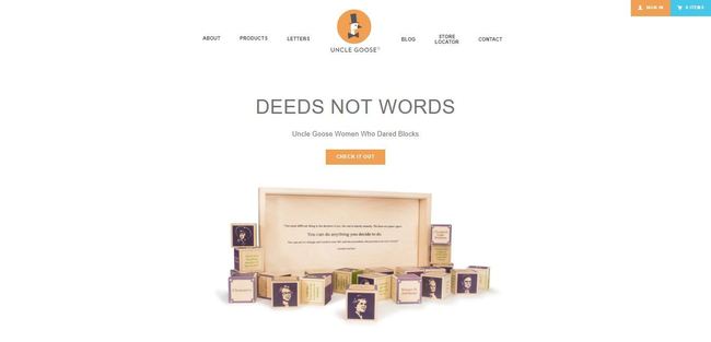
18. Uncle Goose
- There is space – a lot of it. This just makes the whole appearance of the store marvellous.
- Awesome photos and powerful uppercase font that, surprisingly, doesn't bother the eye.
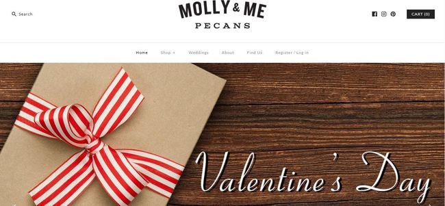
19. Molly & Me Pecans
- Smooth navigation and a very minimal design, with a white background and thin, retro looking font.
- The shipping calculator allows the customer to see the exact shipping fees before submitting all the details.
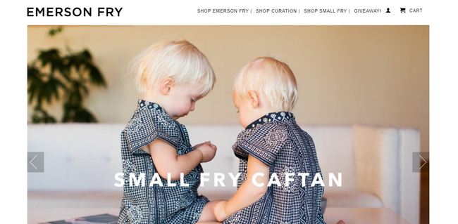
20. Emerson Fry
- A well-known name in the world of fashion, Emerson Fry blends their shop and blog on the same page – a great way to get more targeted visitors and to increase their search engines ranking.
- Super clean design, the only intrusion being the right sidebar ‘Service' tab that's a live chat system.
- To avoid cluttering the header area, they opted instead to display all their info like shipping, promotions or returns, in the footer, visible only to those who scroll to the end of the page.
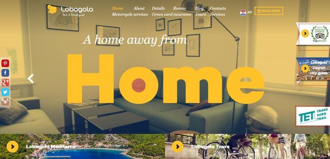
21. Lobagola
- This is a very experimental site. The 360-degree view is very creative and a wise choice for a bed & breakfast. Check the website, the picture below doesn't do it any justice.
- A well-chosen unique selling proposition can make all the difference. ‘A home away from HOME' pictures exactly what people want to experience when visiting other cities/countries.
- The ‘BOOK HERE' button is made more visible so visitors don't get confused, especially with this rather different website design.
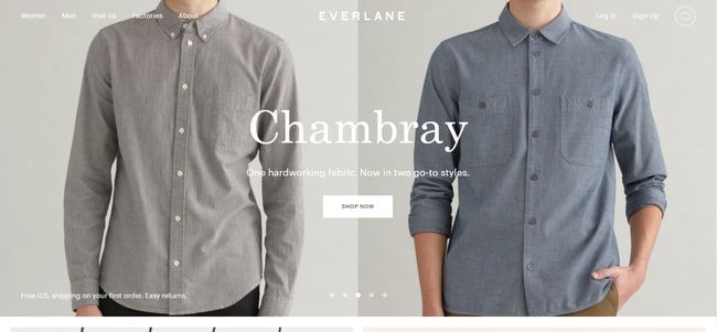
22. Everlane
- Your first order ships free – that's like an instant customer.
- If you need inspiration for your product page, you should check Everlane. Whoever lands on this page knows exactly how the product feels and fits. They are very transparent and explain exactly why their products have such a low price.
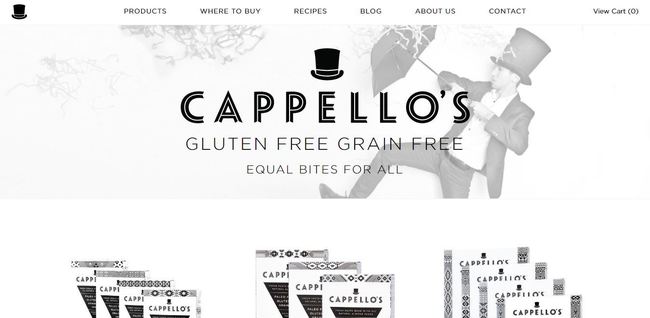
23. Cappello's
- Instead of featuring a boring rant, Capello's went the other way and wrote about an Argentinian tradition while also adding a short recipe.
- The product packaging, while black and white, is both ethnic and modern.
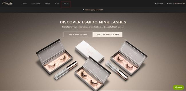
24. Esqido
- Esqido has a very attractive and simple approach to its referral program – every referred person that buys gives the referral $10. If you take into account that the most expensive lashes are less than $50, this is a sweet deal. The buyer gets back 20%, a big chunk.
- The Olark ‘Message Us' chat grabs the questions people might have and “pushes” them to the ‘Buy it' button.
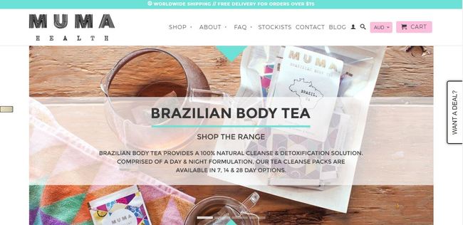
25. Muma Health
- Once users click on the ‘Cart' icon, they're redirected to a page where they can find the estimated shipping fees by simply selecting the country and zip code – this reduces cart abandonment and helps customers decide faster if they want to buy or not.
- On this page, like on any other page of the site, there's the “Muma – get a 10% off for subscribing” that's actually a smart and non-intruding newsletter popup, which is only activated after about thirty seconds or so.
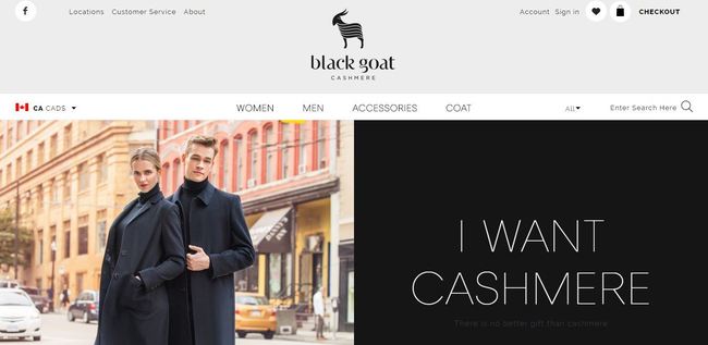
26. Black Goat Cashmere
- The second you land on this website you know they sell luxury products – sleek, modern theme with gorgeous product photography.
- On the main page, they have links to everything, from product categories to ‘Gift Cards', ‘Mailing List' or ‘Wishlist', making it easier to find something.
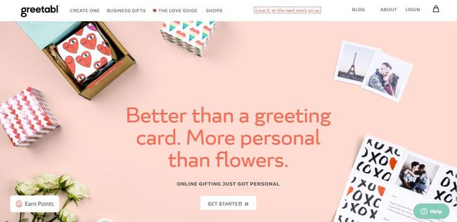
27. Greetabl
- Awesome idea and awesome products: small gifts made cool with a personalized handwritten message and cute gift boxes. Lovely page design and product photos, very Instagram like vibe.
- Clean design with the links within the main navigation linking to anything someone who ends up on the site might be looking for.
- Also, a get 10% off coupon popup greeting for just typing in your email id, which isn't annoying at all.
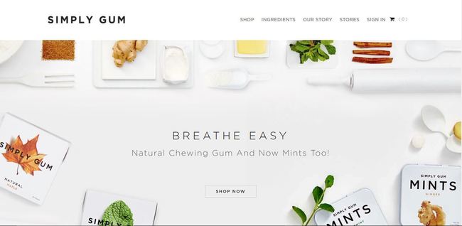
28. Simply Gum
- Gorgeous one-page layout which makes for a very intuitive navigation.
- Clean design, no popups or disturbing scripts, just scrolling up and down.
- They displayed above the fold all the info the user needs, the flavors, and the fact that their gum is 100% natural, the last one being a huge selling point.
- The flavor photos are a nice touch as they look more tempting than a simple gum pack.
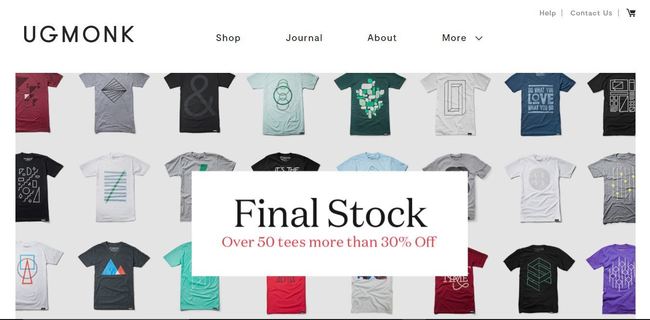
29. Ugmonk
- Simplicity at its best. Simple design, a product slider featuring the latest deals and products, plus easy navigation.
- The newsletter and social networks buttons are displayed in the footer area to avoid hindrance to the user experience.
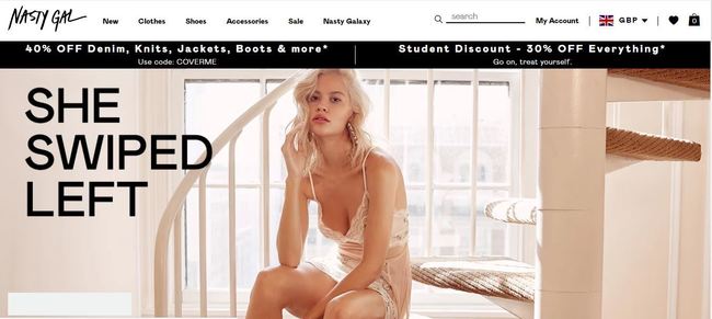
30. Nasty Gal
- The Nasty gal greets you with a 25% OFF coupon code for signing up to their newsletter.
- Very few people want to buy something that's from an older collection, especially if we're talking fashion. Nasty Gal has a ‘What's New' section where the visitors can browse their latest stuff by a lot of filters, including price, color and size.
- As you scroll, you're accompanied by a ‘Live Chat' button where you can ask for help regarding product sizing, shipping or even get styling advice – the last one is very important as it can usually mean the difference between a sale and an abandoned cart.
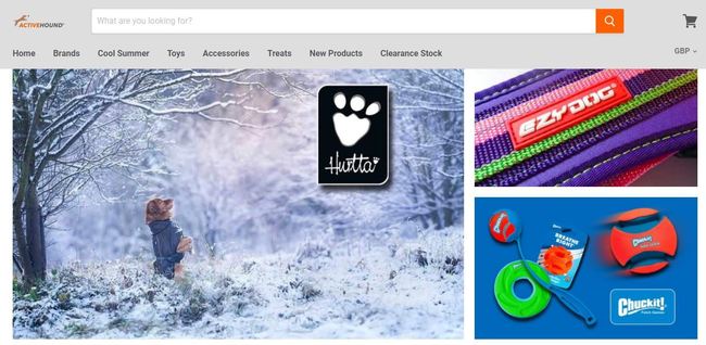
31. Active Hound
- Here we have a simple design with collapsible categories which allow the user to have a glance at your categories without having to browse the site.
- The ‘Reviews' tab on the left side of the website appears on every page and it's a great way to gather more reviews or to attract new customers.
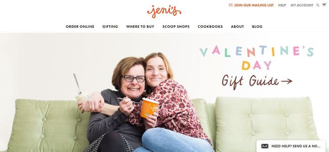
32. Jeni's
- The design will make you crave for ice cream badly. The super tasty photos and the GIFs are a nice touch.
- The store even has a gift guide. Have you ever thought of getting someone ice cream as a present?
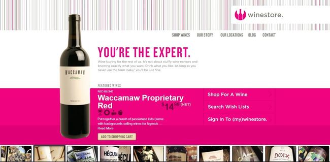
33. Winestore Online
- A hell of a wine store, this one might not have a very catchy name, but it has a very strong and smart design, with a nice choice of fonts and colors.
- As you can see, every wine has some little icons for color, body, and flavor so it’s a lot easier to pick the perfect wine.
- Not only this, the product filters are very well thought out too, from price tag to pairings and occasions – the “breaking up” one is quite hilarious.
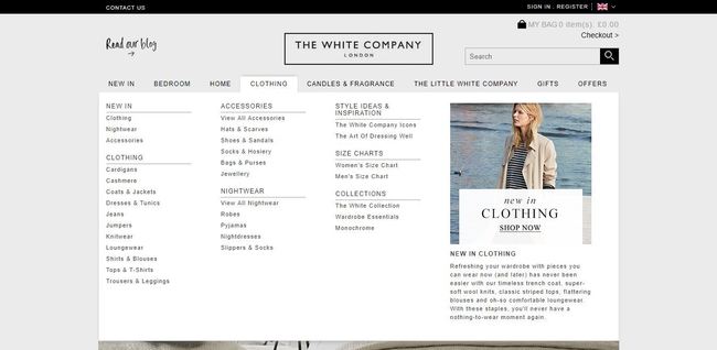
34. The White Company
- “It all began over 20 years ago when Chrissie, unable to find well-designed, beautiful quality bed linen, principally in white, established The White Company to make them.” If you created your website for a specific reason – other than making money – say so in your ‘About Us' page.
- The ‘Our Journey' slider takes the visitor from 1994, when the business was launched, up to today, and tells the exact story behind this very famous brand.
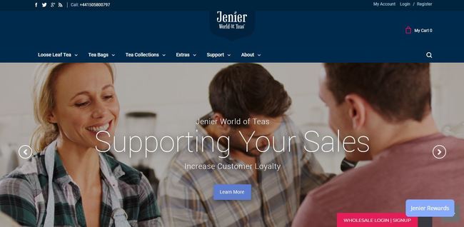
35. Jenier World of Teas
- This is how you organize your categories the right way: their teas are listed by types (herbal and fruit ones), by source, and they even feature the tea of the week pick. It's wayeasier to find something and it's also tempting to check back and see what new pick they have for the tea of the week. Am I right?
- You find out if they ship worldwide and how much the UK shipping fees are – where they ship it from – from their main page, which eases up the process thus helping users decide if they want to keep on browsing or not.
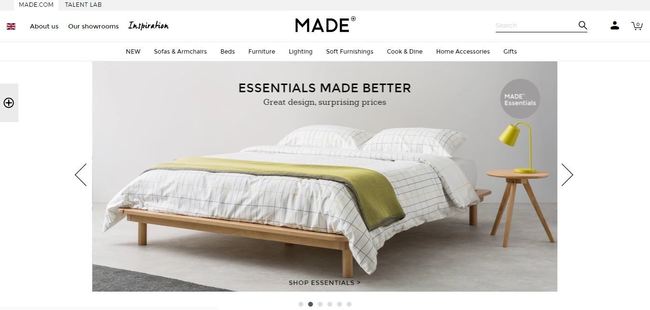
36. MADE
- Forget Amazon, Made has an incredibly well thought out product page. There's a video, a ton of extra pictures – including customer pictures – and a lot of details, from size to shipping fees.
- Every page has the related products feature which keeps the visitor on site and increases the chances of an up-sell.
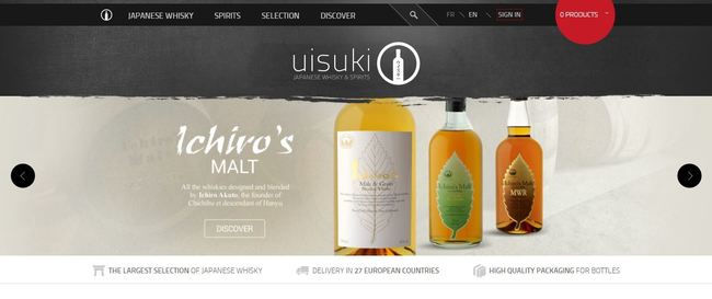
37. Uisuki
- Once you add a product to the cart, a popup opens showing the product added and a slider with other relevant products, allowing the users to spot something they might have missed.
- On the ‘Cart' page the shipping fees are automatically displayed – by default for France, the country from where they ship – but once users go to the next step, the fee updates based on weight and the country added.
- Let your visitors know that your website is very secure and they're not exposed to any risks. ‘Secured Payment' does exactly this and it also lists the type of payments used.
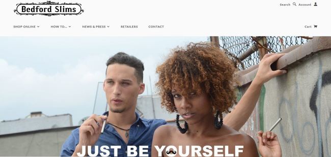
38. Bedford Slims
- These guys decided to have a “how to” guide for their e-cigs. This is a smart way to cut down on the support emails they receive.
- Nice, simple layout that features everything, from current deals to their social platforms activity.
- Plus, they don't want kids on their website. There's a popup which requires you to log in your birth date but, of course, the kids can lie. They have earned my respect!

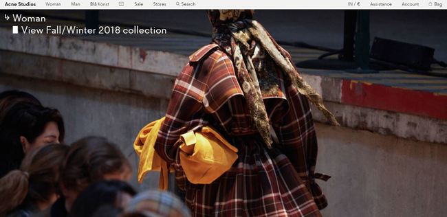
39. Acne Studios
- Acne Studios has a different approach when it comes to their categories. Instead of having a lot of product filters, like ASOS, for example, they simply have everything on one page. If you have a lot of products, this strategy might not work as this will affect the load speed of the site, but otherwise, it's a really cool feature.
- When users scroll on the page, they're greeted with a small personalized newsletter popup, the female/male option helps her/him get more targeted content.
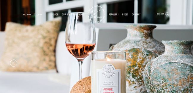
40. Circle 21 Candles
- You get a very warm, cozy feeling when you land on the website. It suits the niche they're in, and that's what smart design does.
- Minimal design paired with simple product labels work towards the simple, uncomplicated life they want to promote.
- If people don't want to splurge $25 on a single candle, they can order a scent sampler for only a fraction of the price. That's genius and it's sure to lure customers to order.
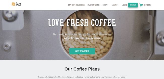
41. Pact Coffee
- Telling a story has never been this easy. Just by scrolling their main page you find out what they sell when you'll get it, and what happens if you don't like it.
- A fresh and modern design, with a thin font and very appealing icons/pictures.
- Phone number displayed in the footer area, so the visitor doesn't have to click too many times before seeing it.
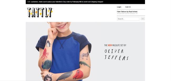
42. Tattly
- Knowing your audience well is very important, and these guys here did their homework. The design is very modern and with funky touches, just like their targeted audience.
- Temporary tattoos can be hit-or-miss so knowing how to apply them right is essential. Their guide is both useful and fun. This is their advice for those who want to remove a tattoo: “Remove it? Are you serious? It looks so lovely on you. Ok, fine!”
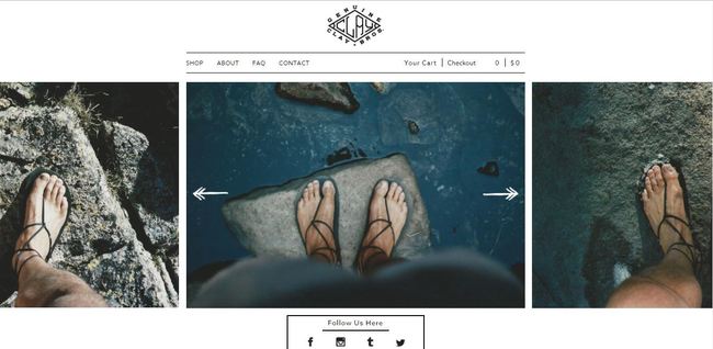
43. Clay + Bros.
- All the action happens on the main page. The users are redirected only when they want to check out, making the navigation pretty effortless.
- Again, because their sandals require some effort in putting on, they added a simple video to show exactly how to do this.
- On this page, the visitor can also find a printable sizing guide that can be downloaded, printed, and tried by simply putting the foot on the piece of paper. Clever, right?
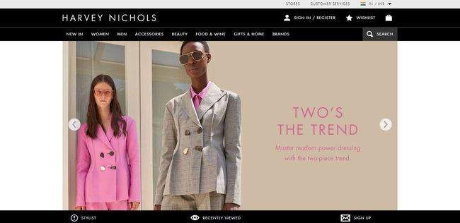
44. Harvey Nichols
- A very cool layout is paired with gorgeous product photos and simple navigation.
- The' Recently Viewed' field helps users find a product they saw without having to follow the exact same steps they followed the first time.
- Even if the site has a lot of visuals – the product slider, the categories, featured articles or brand focuses – it loads very fast, which is vital.
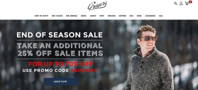
45. Grayers
- The navigation is simplified tremendously with the drop-down categories which allow users to go directly to the category that interests them the most, instead of having to click through 4-5 pages.
- Simple and responsive design, with neatly organized products.
- 20% on your first order. All you have to do is subscribe to their mailing list.
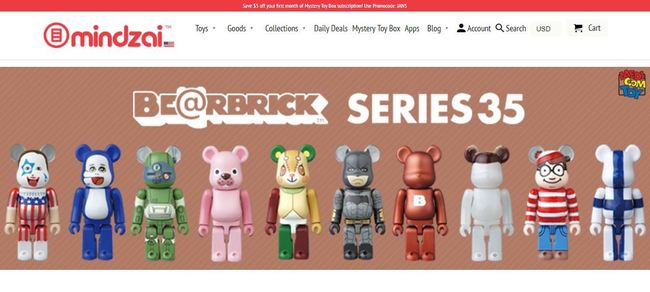
46. Mindzai
- ‘The 5% Off' popup for those who subscribe is a great marketing strategy. People are always tempted to get a discount, especially if the only thing they have to do is to subscribe.
- Another great decision is to have the Olark live chat plugin which allows visitors to have their questions answered immediately.
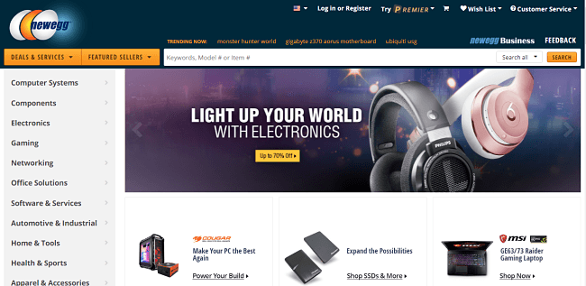
47. Newegg
- Gorgeous and minimal design apt for a technology store.
- The bestsellers are displayed as the most trending products.
- Products are reviewed and tested before being sold to the public. Promotions are aplenty.
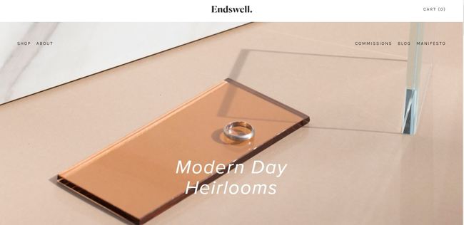
48. Endswell
- Does your website have a manifesto? This one is quite simple but it covers their past, present and future.
- The somewhat vintage effect fits very well with the products they sell.
- Also, each piece of jewelry has a very explanatory picture that shows exactly how it looks. This is very helpful for those intricate pieces of jewelry where you aren’t able to see all the details. A small element, but it can be very helpful for the wavering customers.
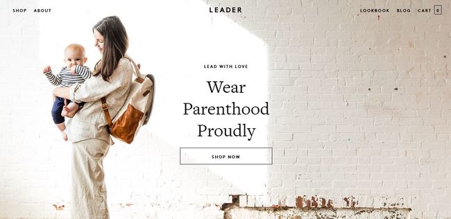
49. Leader Bag Co
- They had a minimal one-page design but now have few dedicated pages that focus on delivering a very smooth experience for customers.
- Gorgeous product photography for something that is usually considered not too glamorous: for example, diaper bags.
- 10% coupon for subscribing. Who wouldn't?
50. Thermodo
- Even an FAQ page can look good and this site stands proof. Instead of the plain text page, we see in most stores, here we have text, images and a video, tackling areas like shipping and basic product features.
- Design wise, the now classic full-width page and a bigger, chunkier font make up for some very interesting visuals.

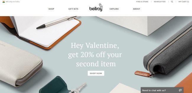
51. Bellroy
- Because they sell a product – the Bellroy slim wallet – that fixes an issue, the one of bulging wallets, they have a page just for this, where visitors can use a slider and compare the Bellroy wallet with a regular one to see the actual difference between the two wallets.
- To further help their customers, these guys break their products in two categories, making it easier to pick the right one.
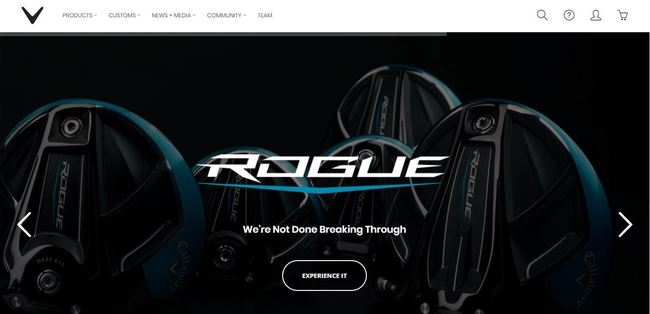
52. Callaway
- Callaway Golf has a responsive design packed with super quality, high-resolution pictures.
- If you think your product page needs a few touch ups, check theirs. It has everything from videos helping you decide if the golf club you want to buy checks all the boxes it should, to a lot of updates and tweets.
- The Cart Page is also very well designed, featuring related products the customer might like – great up-sell – and detailed shipping info.
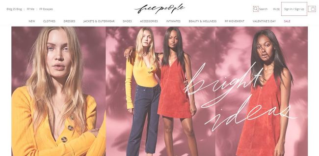
53. Free People
- Customers, precisely women, can get lost browsing the homepage. This alone has enough content to stare at for a couple of minutes, linking to various collections and products.
- Product navigation is in the main menu, right under their logo, while customer service pages and all the social links are in the footer to avoid cluttering an already super full design.
- Their blog is perhaps one of the best ones at this moment, having around 3-4 posts daily and providing unique content both for their readers and for search engines.
54. Creatures & Features
Update: They are going through a renovation phase now.
- Creative design and very explanatory home page. After a couple of seconds, you find out what they’re selling.
- Clean navigation, the menu pops up after you click on the three horizontal lines next to the cart, and the buyer has all the info there.
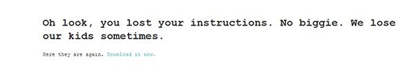
- This is such a fun shop! “Oh look, you lost your instructions. No biggie. We lose our kids sometimes.” – this is above the link for ironing instructions. If you can use humor, do it.

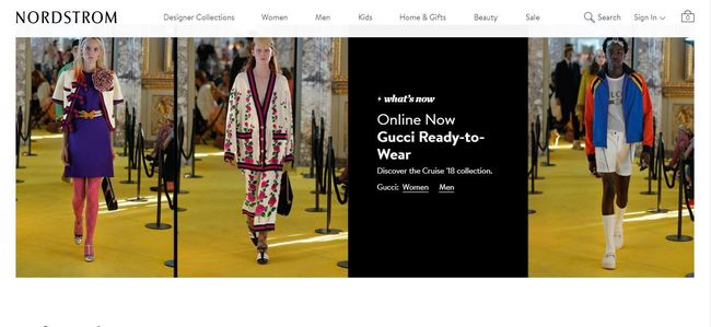
55. Nordstrom
- Nordstrom is a strong contender for ‘the highly optimized and well-designed product page' prize. Customers can find everything here, from product info to reviews.
- A super smart thing they use is the ‘See fit information from our customers' link which redirects the user to the customer reviews field located beneath. Not only this, but they also have a feature that allows customers to find their ‘True Fit', which is very useful in the clothing industry.
- Great customer service isn't the only thing they do by the book, Nordstrom also has free shipping which is one of the most important things people look for when it comes to online shopping. They let you know about this the moment you enter the store.
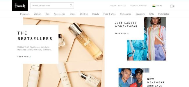
56. Harrods
- The small ‘Brands', ‘Customer care' and ‘Favorites' fields that follow the users as they scroll up and down, are very handy and time efficient.
- Right above the footer, they have image categories. Very tempting to click on them.
- Their homepage is very self-explanatory, featuring the latest collections, some products worthy to be on a ‘Wish List' and even links to their street style advice.
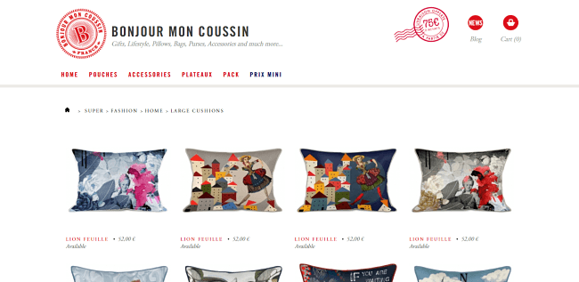
57. Bonjour Mon Coussin
- The illustrated categories make the site easier to navigate, especially if a non-French user happens to land on the French version of the site.
- As many other examples, this one also has a product slider with their current offers and deals.
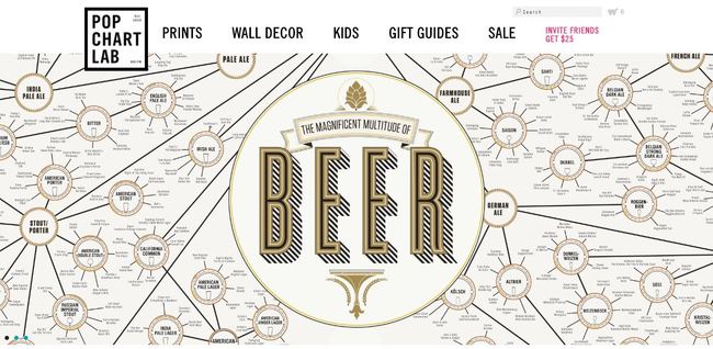
58. Pop Chart Lab
- This is for all charts lovers out there. From ‘The evolution of bicycles' to ‘The Beatles song chart', here you can find pretty much anything, all displayed in a retro manner on a super modern layout.
- They take things to the extreme. Even their logo is a miniature chart.
- Once a product is added to the cart, a small popup appears showing links to ‘Checkout' and other related products, so no time-consuming redirects.
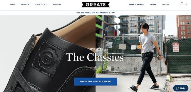
59. Greats
- The ‘Want $10 credit?' surely gets a lot of clicks and translates into a lot of unplanned purchases, especially if shipping fees are low.
- Other than that, their product page – basically their whole website – is a masculine version of Free People: eye candy products, cool photos and even some street style snaps.
- The deconstructed shoe picture was a great idea. All customers need and like to know exactly what they’re getting.
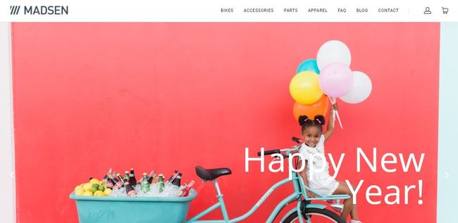
60. Madsen Cycles
- As you might have noticed already, this site uses the same theme as Creatures & Features, but they decided to add an Instagram widget. It's friendlier and the user can get a glimpse of the brand.
- Gorgeous product photos, pure eye candy, regardless if you're a cycling fan or not.
- And a $100 off for your first purchase. Because they know you will.
What will be the biggest ecommerce trends for 2018?
2018 promises to be a year of record sales and with the fine line between online and offline being even more blurred, and it will be very exciting to see what's next. These are some of the most important trends to keep an eye on in 2018. (note: we've covered all the major trends in epic detail in this post)
1.Voice Search
I'm sure you've been noticing this growing trend over the past few years, but 2018 will see a rapid spike in both voice search usage and development.
While adoption rates are still on the lower side- public opinion and perception of voice search is clear:
Geomarketing reports that 65 percent of people who own an Amazon Echo or Google Home can’t imagine going back to the days before they had a smart speaker.
Now, on how you can capitalize on this trend:
Guess how Google provides results for voice searches using NLP (Natural language processing)?
Featured snippets.
With an increasing number of search clicks being lost to featured snippets, it's getting more important to learn to optimize your posts for featured snippets. And now with Google and most other search engines using featured snippets for providing results for voice searches, it's high time you learnt how to.
I've covered the step by step process in epic detail in this post:
5 Ecommerce Trends for 2018 & How to Capitalise on Them
2. Usage of Augmented Reality in Ecommerce
The benefits of using Augmented reality in ecommerce is obvious.
Imagine the user experience you could provide to your customers if they could trial the products, say, a sofa, without actually visiting a physical store or outlet?
Ikea has already started offering this feature and it has gained a lot of attention and buzz.
The possibilities in this industry are endless, with potential applications in the healthcare, fashion, and many other areas.
3. Spike in Video Marketing
Videos are evolving to form an integral part of the marketing strategies of most brands. We expect that 2018 will see a huge growth in the usage of video.
This trend has been evident over the past few years- noticed how the biggies like Entrepreneur, Inc, Forbes etc have videos on almost all their posts?
Much more brands are jumping on the video marketing bandwagon.
And we aren't just talking about video product descriptions. Video will become one of the major channels for both content marketing and advertising.
For starters, you can use tools like Lumen5 to create simple videos like this one, which you can use for both branding and driving traffic:
You can see the entire step by process for creating a video using Lumen 5 here.
4. Amazon's Foray into Digital Advertising
While Jeff Bezos's net worth became huge news last year, Amazon is poised for much more explosive growth in the coming years, as they execute their plan to introduce one of the most robust display advertising networks in the world.
Take a look at Amazon's product line:
From Twitch TV, Audible, Prime, Kindle, Amazon Home Services, Alexa, Prime day (more on why this a product line later), and the Dash button, to the Echo.
Get the gist?
These are not just products. They're marketing channels and advertising platforms. They've already begun to advertise on Echo and Alexa and the Dash button is a perfect example of their plan to foray into the advertising space.
Wondering how to get involved?
Start by creating your own set of Skills for your brand.
And what's is an Alexa Skill?
Skill is simply content that you can market through voice search gadgets like Alexa and Echo.
Amazon allows brands to create engaging skills and reach customers through the millions of Alexa-enabled devices using the Amazon Skills kit.
5. Integration of Crypto Payment Processors
The usage of cryptocurrencies is increasing at an alarming rate.
If this trend continues, and if the current hurdles such as transaction fees and block volume that bottleneck the adoption of cryptocurrencies like bitcoin as a payment option are overcome, ecommerce transactions will change forever in 2018.
Crypto payment processors like Bitpay and Chainpay have already begun offering integrations for ecommerce platforms like Shopify and Bigcommerce, and this trend will continue, and more processors will begin to offer integrations for ecommerce platforms. We've covered how to set up Bitcoin payments on ecommerce stores here:
Everything You Need to Know About Bitcoin and Blockchain in Ecommerce
And as the usage spikes, crypto enthusiasts will start paying with cryptocurrencies like bitcoin and ethereum.
And just these- developers have begun to develop promising open source decentralized ecommerce business models on blockchain technologies like Ethereum that allow the creation of applications.
This area is definitely worth paying attention to for ecommerce marketers.
How many of these aspects do you focus on already? Creating a successful online business doesn't come easy. You always have to focus on delivering the ultimate experience to your customers, to analyze your competition while doing your best to stay ahead and to know when it's time to change gears. To wrap things up, it seems ecommerce will hit new records this year and a well thought out plan can make all the difference. Choose an ecommerce platform that works for you. This guide will help you eliminate those that don't suit your niche. And get going, push your online store to the limits.
Feature image by Joe Anderson
Original Article written by Catalin Zorzini